
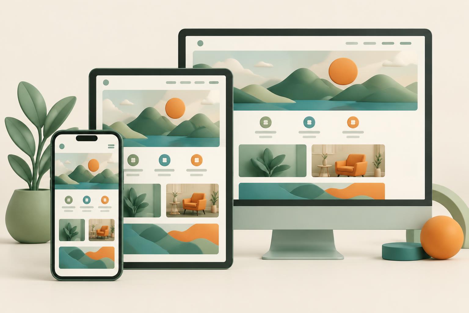
In 2026, the internet continues to be a mobile-centric world. If your business website isn't built with mobile users in mind, you're not just falling behind; you're actively pushing potential customers away. For small business owners, understanding and implementing a mobile-first approach isn't a luxury—it's a fundamental requirement for success. It impacts everything from how customers find you to whether they choose to engage with your products or services.
Think about your own habits: how often do you reach for your phone to look up a restaurant, check reviews, or browse a product? Millions of others are doing the same. This constant, on-the-go access means that a clunky, hard-to-navigate mobile experience is a deal-breaker. By prioritizing an intuitive, fast, and visually appealing mobile experience, you position your business to capture more leads, build better relationships, and stand out in a crowded digital landscape.
What Mobile-First Design Really Means Now
The term 'mobile-first' has been around for a while, but its meaning has evolved from a technical preference to a core strategic imperative. Historically, websites were designed for large desktop screens, and then 'adapted' for smaller devices. This often resulted in compromises, slow loading times, and a frustrating user experience on phones.
Today, mobile-first means starting with the smallest screen. You design and develop the core experience, content, and functionality for mobile users first. Only after that foundation is solid do you progressively enhance it for larger screens, adding more complex layouts, animations, or features that make sense for a desktop environment. This 'progressive enhancement' approach ensures that every user, regardless of their device, gets the essential information and a smooth experience.
It’s about more than just a 'responsive' website, which simply rearranges elements to fit a screen. True mobile-first thinking considers the mobile user's context: they might be on a slow connection, quickly scanning for information, using one hand, or even searching with their voice. This influences everything from button sizes and navigation menus to image optimization and the conciseness of your copy. If you're building a new site or overhauling an old one, this mindset is non-negotiable for current websites, hosting, and SEO.
Why Mobile-First is Critical for Your Business's Visibility
In 2015, Google made it clear that mobile-friendliness was a ranking signal. Today, it’s foundational. Search engines primarily index and rank websites based on their mobile version. If your mobile site is slow, buggy, or difficult to use, your search rankings will suffer, regardless of how good your desktop site is. This is especially true for local businesses, where mobile searches often lead directly to a purchase or visit.
Beyond traditional SEO, the rise of AI-powered search answers and generative experiences (often called AEO or Answer Engine Optimization) means that clarity and conciseness on mobile are paramount. AI models scrape information, and if your mobile content isn't easily digestible and structured, it's less likely to be chosen as a definitive answer. A good mobile experience also contributes to better user engagement metrics—lower bounce rates, longer time on site—which indirectly signal to search engines that your site is valuable. For more on this, check out our insights on AI search visibility.
Moreover, your Google Business Profile (GBP) is often the first interaction a mobile user has with your business. Ensuring your GBP links to a perfectly optimized mobile site means a seamless journey from search result to customer action. Your website needs to reinforce what your GBP promises.
The Direct Impact on Your Customers and Your Bottom Line
A seamless mobile experience isn't just about search engines; it's about your customers. When 60% or more of your website traffic comes from mobile devices, any friction point becomes a lost opportunity. Consider these impacts:
First, Conversions. Whether you're selling products, booking appointments, or generating leads, a poor mobile experience kills conversions. If a customer can't easily navigate your menu, fill out a form, or complete a purchase on their phone, they'll leave. Fast. They're not just leaving your site; they're often going to a competitor who does offer that smooth experience. This extends to every touchpoint, from initial browsing to signing up for email and text marketing lists.
Second, Reputation. In an age dominated by online reviews and social media, user experience directly impacts your brand's perception. A frustrating mobile site can lead to negative reviews or comments, eroding trust and discouraging new customers. Conversely, a fantastic mobile experience can turn casual browsers into loyal advocates.
Third, Efficiency and Future-Proofing. Developing mobile-first forces you to be concise and prioritize essential content and functionality. This disciplined approach often leads to a cleaner, faster, and more effective website overall, saving development time and maintenance costs down the line. It also prepares you for the next wave of tech, whether it's more sophisticated voice search, augmented reality, or even more diverse screen sizes.
Finally, Privacy and Speed. With increasing privacy regulations and the user expectation of instant gratification, a mobile-first site is inherently better equipped. It's often lighter, loads faster, and can more easily integrate privacy-respecting analytics and tracking methods without bogging down the user experience. Faster load times directly correlate with happier users and better engagement.
The mobile-first mandate isn't going anywhere. It's evolved from a design trend to a core business strategy. If your small business isn't prioritizing the mobile experience for your customers, you're missing out on significant opportunities for visibility, customer loyalty, and growth. Embrace it, and watch your business thrive in the modern digital landscape.
Ready to ensure your website is truly mobile-first and optimized for today's digital world? Let's talk about how Digital Harvest Marketing can help. Book a call with us today.