
Small business owners have to account for
mobile devices within their marketing strategy in 2018. Otherwise, their
competition is going to quickly leave them in the dust.
With every passing year, we rely increasingly
upon our mobile devices to keep us connected. In 2014, mobile web traffic
surpassed desktop traffic. Now, we spend an average of 5 hours a day using our mobile devices!
For business owners, this trend means that if
someone is looking at their website, consuming digital content, or looking at
an online ad, it is more likely than not occurring on a mobile device. Without
awareness of the ways mobile has changed consumer habits, many small business
marketing strategies won’t just fall flat — they flat out won’t work at all.
To help you prepare for a mobile-mad consumer
world, make sure you take the following six 2018 small business mobile
marketing trends to heart:
People Increasingly Demand Mobile-Centered Website Design
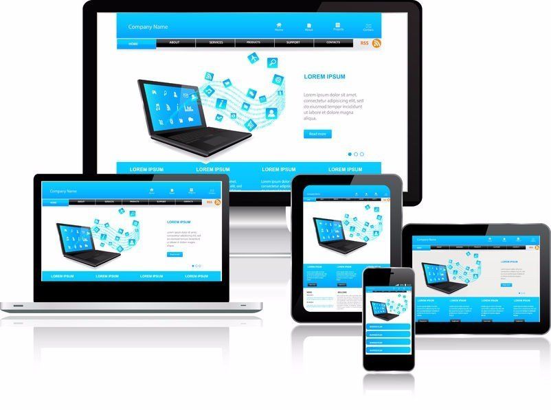
Just over half (51%) of all website visits now
come from mobile devices. So, someone who is visiting your mobile website is
most likely doing it on a tiny screen.
The first step to accommodating these mobile
visitors is to ensure your site uses a reliable responsive design, which automatically scales
down and rearranges site elements to look presentable. Most often, the change
results in a website that navigates as a single scrolling page.
If you want to see if your website fits
responsive design recommendations, you can use Google’s mobile friendly test.
Good Mobile Experience Tops SEO Demands
At this point, responsive design is table
stakes for all businesses. Your website should therefore not just be responsive
but intuitive to navigate on a relatively small touchscreen display.
Having a highly usable site doesn’t just
encourage more visitors to linger. It also sends signals to search engines that
your page is worth visiting, potentially boosting your ranking position above
competitors. Conversely, events like someone clicking “Back” after just five
seconds on your site can hurt ranking.
Elements that improve usability for mobile
users include:
●
Simplified site layouts that
contain no more than 5 main page categories, reducing needed clicks to navigate
●An always-present navigation menu,
most often the classic “hamburger menu” positioned in the top corner, although
having a few additional icons helps
●Easily presented information that
follows an “inverted pyramid” approach with the most important details shown
first
Kimberly de Silva of BiznessApps
puts the approach best: “Cut your
copy and content down to the bare essentials.” She stresses that you will want
your design to, “seamlessly guide \[visitors\] to conversion without any
distractions.” To improve clarity and directness, you can put non-essential
information in side menus or in-text links within content.
Accelerated Mobile Pages (AMP) Boost Site Speed, UX and SEO

Accelerated Mobile Pages (abbreviated “AMP”)
is a project from Google and dozens of other tech collaborators
intended at
reducing page load times for website users. Developers code AMP pages to have
as little getting in the way of quick load times as possible.
Fast-loading pages matter to mobile device
users. They usually want answers _now_
.
Statistics show that people will be [90%\\
more likely to abandon a page that takes five seconds to load](https://yoast.com/page-speed-ranking-factor/)
compared
to one second.
Google also offers a small search engine
ranking boost to pages that use AMP guidelines.
Even if you don’t have the resources to switch
your pages to AMP, you can still reduce your load times and improve user
experience (UX) in other ways. Take Google’s PageSpeed Insights test
for
tailored suggestions.
Huge Shift Towards a Video-Centered Content Strategy
Videos are easier to watch on mobile compared
to reading text — or even trying to digest colorful infographics. There are
many reasons for this: video is passively consumed while text or large images
have to be nudged around. Motion is easier to detect on small screens compared
to discerning tiny static details.
For whatever, reason, people can’t get enough
of mobile video. A third of online activity is now spent watching video. And video content
gets snatched up quicker compared to non-video. For instance, adding a video to
your landing page can increase conversions by over 80%. Blogs incorporating a
video get three times as many inbound links.
Put simply: if you want more clicks, then try
switching more online ads and organic-style content to video. You will
accommodate your mobile audience better (who are 50% of your views, anyways),
and you will drive improved engagement all around.
Micro-Moment Approach to Content and SEO

Not only is mobile-centered content moving
towards video, but it’s also moving towards satisfying what Google calls “ micro-moments
” of need. A micro-moment refers
to anytime you pull out your smartphone of tablet to answer an immediate question.
One common example is that people will search
for a business name followed by “...near me.
” So, instead of
searching for “guitar store”, they might search for “guitar store near me.”
Search results will display according to the user’s last known location.
Ranking for “near me” requires a localized search keyword focus, so using
“guitar store in Utica, NY” as a keyword emphasis on your website can help
improve “near me” search rankings.

Other micro-moments include times people need
answers. So, someone might search for “how do I repair a broken peg on my
guitar” and expect to find a quick video on the topic. Businesses can
capitalize on this need by providing helpful content in addition to keywords
mirroring the intended search, like “guitar repair in Utica, NY.”
When trying to satisfy micro-moments, there
are two additional things to keep in mind: people may be searching for very
specific content ( long tail) and they may be asking their
phone’s voice assistants to make the search for them ( [semantic\\
search](https://moz.com/blog/what-is-semantic-search)).
In response, try to offer a lot of quick, to-the-point
articles and emphasize titles that reflect sentence-style questions people may
ask. Using a music store example again, a semantic, long-tail search would be
“where can I rent a trumpet near me?” compared to someone typing “instrument
rental, Utica, NY.”
Forming Attribution Strategies and Tracing ROI

As a final note, small business owners must
take care to track how their efforts in mobile-centered marketing are doing.
Yet, one in four retailers say they have no method
for attributing mobile marketing interactions to final purchases.
Using an attribution strategy like having
people redeem coupon codes in-person can help connect a mobile ad to a final
in-store purchase. Other times, business owners estimate how many percentage of
impressions and click-throughs generate to a final sales conversion. So, if 5%
of web page visitors are spending an average of $42 in the next week at your
store, then each page visit is worth approximately $2.10.
Ensure that, at the very least, you are
setting marketing goals for your content and paid ads in the form of hard
metrics. By tracing return on investment (ROI), you can optimize the amount you
spend and chase better and better results over time.
Use These Small Business Mobile Marketing Trends to Find Success on the Small Screen in 2018!
By letting trends in mobile use and marketing
influence your website design, your SEO strategy, and your approach to content
marketing, you can improve your chances of success overall. You will also avoid
giving up ground to competitors.